Improve Your Web Design Skills With This Introduction to Typography
Typography is the set of techniques used to express and arrange characters - making them easy to read, and pleasing to the eye. Even within the same sentence, by differing typography styles, you can control the visibility and impact on the reader. For example, if the font size of all the text on this page was the same size, wouldn't you find it a little hard to read?
Like in the Desktop Publishing Industry, knowledge of typography is important for Web Design, as well. World-renowned agency Information Architects Inc. - a pioneer of information architecture - has claimed that "Web Design is 95% Typography." Let's take a look at what that means.
The IT Industry Guide is a collection of articles and resources by Internet Academy, Japan's first learning institute specialising in the Web. Here, we introduce you to industry insights in an easy-to-understand manner.
Table of contents
Basics of typography
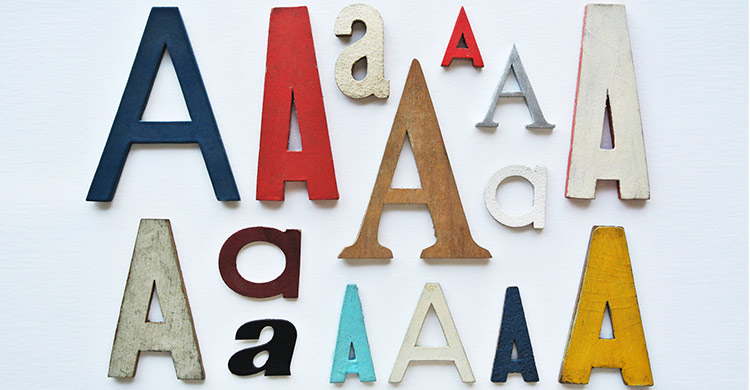
Whether you are going to be showcasing your text in a graphic, or as a textual sentence, you will need to consider the appropriate typography to suit your purpose. Make sure to choose a font that suits the tone of the design and the text copy, and pay attention to whether it is readable and attractive for readers.
Typography in Web Design
Aside from the importance of leaving a strong impression on readers, most of the information on the Web is composed of characters. For this reason, it is one of the essential elements of effective Web Design. Therefore, you need to always think about typography in terms of how it will affect the reading experience of the users.
Changing font size, colour, and weight
In general, Gothic is strong, and Serif gives a softer impression. In addition, by changing the colour and weight of the characters (thickness), you can control the impression on the reader. If you want to express strength and authority, for example, you can use a bold Gothic font in a high contrast colour. If you want to express subtlety and flexibility, it is better to use a fine-print Serif font in a colour that has minimal contrast with its background.
Reduce the number of font families and sizes
Using too many fonts and font sizes may dilute the effect of your message to the user. In a single document, try to limit the number of fonts and sizes to three different kinds to keep the message clear. For clean Web design, let us try to use variations in colour and weight to highlight important sections, instead of changing fonts too often.
Add visual guidance for a sense of rhythm
By creating a rhythm to the changes in font size and colour, it is possible to give a priority to the information you want. If statements of high importance look the same as the rest of the text, visitors might notice or may get lost. When considering the font size and layout, first try to look at the information and attach a priority. You can then create a design that is meaningful.
For example, when expressing page numbers in books, a smaller font is used to show the passing of pages. However, because of the continuity of rhythm that it creates, it is very easy to see, despite the decrease in size! Similarly, you can use this concept in your web design layouts as well. Create spaces that users will understand belongs to certain kinds of content, and they will begin to understand how to navigate through your web copy.
Layouts that are easy on the eye
If you have too little space between one line and the next, there is a possibility that users will end up losing their way. Additionally, this creates a very stuffy atmosphere, straining the eye while users try to keep track of what they are reading.
In order to make easy-to-read text, be aware of the natural movement of the eye. In general, people's eyes move from left to right, and the most comfortable horizontal line spacing is about 150 to 190 percent. In general, try to also keep the information in each line to approximately 50-75 characters, for optimal reading.
In conclusion
A lot of junior Web Designers tend to focus more on the graphical elements of design. But that alone isn't enough. By paying sufficient attention to typography as well, you will reach the next level of design more smoothly. Try to create a scrapbook of good sources with practical illustration on how to achieve this. This will allow you to rapidly grow your skills and expand your repertoire.
-
Web Design
CoursesDesign graphics
& websitesLearn design
tools & techniques -
Web Programming
CoursesDevelop dynamic
websitesLearn the
latest technologies -
Web Marketing
CoursesMarket your
businessLearn to reach
a wider audience